Category Archives: Commentary

A Trumpet Blast

Here’s an interesting post from Randall Grahm on the Been Doon So Long blog titled “Chick Vit or What Do Women Want (in their Wine)”. While the post starts out with the question of whether his wines might appeal more to women than men, Randall covers lots of interesting ground (as usual). Worth a full read, but my favorite bit is this:

Maybe in some of my wines the standard signifiers of “quality,” if not missing, are at least perhaps a bit occluded.12 What actually is “quality” in a New World wine? I think that one would be hard pressed to insist that it is authenticity or trueness to its Platonic essence, because likely there is no such Platonic essence, especially if the wine does not come from a singular vineyard, and that vineyard is not farmed in such a way to optimally express its unique character. I believe that all of us hold some sort of template in our brains as far as what constitutes “quality” and what provokes our interest in a particular wine; likely we respond to wine in ways analogous to other sensual stimuli. Perhaps wine affects us a bit like music does, though its balance and logic does not have the same kind of temporal sequencing. With wine the elements are initially apprehended all at once in a sort of trumpet blast and then slowly, almost imperceptibly they shape-shift and unfold with time. Most people, at least us Westerners, are attuned to tonal music, with a recognizable structure and a predictable, inevitable logic; there is satisfaction and resolution when the melody returns to the tonic, a harmonic resonance of a few key elements. In wine maybe these elements are wood, fruit, tannin and minerals (though nobody really knows what this last category really means). Withal, I would suggest that these flavor elements cannot simply be present but they need to be organized in such a way that suggests that they represent something. Put another way, in a vin de terroir, the unique qualities of the site are driving the bus, in a vin d’effort, a winemaker with a strong stylistic vision is driving the bus. But somebody’s driving.

By the way, it you’re not following him on Twitter, fix that.

For I Am ZINFANDEL!

Last week, in a post on the 7 Deadly Zins 2007 Lodi Zinfandel, I included the poem that was on the back label of the bottle. It reminded me of this poem that used to appear on the back label of Cline’s always reliable California appellation Zins:

Know me, stranger, for I am thy
blood and thy nectar.
I shall wet thy lips, parched
by the winds of deprivation.
And nourished shall be thy body,
desiccated by the scorching
inferno of temperance.
Rest thy head upon my busom,
Lose thyself in the ecstasy of
my caresses,
And know me, For I am
ZINFANDEL!

— Author Unknown

Incidentally, I have a t-shirt with this poem on the back, purchased from the Cline tasting room.

According to this article, Cline removed the poem from the label after drawing the attention of some bureaucrat claiming that “nourished shall be they body” was some sort of health claim. Ridiculous of course, but that never stopped a bureaucrat.

~~~~~

Magician_Master_coverThe last line — “And know me, For I am ZINFANDEL” — reminds me of an uber-geeky reference from my high school days. In the book Magician: Master by Raymond E. Feist, the main character Pug/Milamber (if you haven’t read it, it will take too long to explain why he has two names) goes into a fit of rage over an injustice he is witnessing. Just before he lays waste to everyone and everything in sight with his magical powers, he launches into a scathing monologue that ends with…
“Tremble and despair, for I AM POWER!”

I know it won’t seem particularly impressive if you haven’t read the book, but when you’re reading it the first time as a pimply teenager, it’s epic. Trust me.

I want to see which of my readers was a D&D/fantasy novel geek like me! If you read the novel and/or remember this quote, PLEASE leave a comment.


Is “$20 & Under” the New Low-End for Wine?

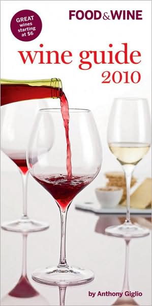
FoodandWineGuide2010I picked up the Food & Wine Wine Guide 2010 the other day. I’ve always enjoyed these guides and have picked them up every other year or so. For each major region they provide an overview of the style of wines produced along with recommended wines and tasting notes. It’s necessarily general given that it’s trying to cover so many regions and remain a “pocket” guide, but it’s a good browsing book. In fact I used to keep one in my car and would glance at it when stopped at red lights! (I like Oz Clarke’s pocket guides, too.)

But the reason I’m posting about it today is the way the guide handles price categories. Each wine noted in the guide (and remember they’re all recommended wines) is labeled to indicate quality and price. The 2010 guide uses the following categories:

QUALITY

★★★★ OUTSTANDING Worth a search

★★★ EXCELLENT Top-notch of its type

★★ VERY GOOD Distinctive

★ GOOD Delicious everyday wine

PRICE

$$$$ OVER $60

$$$ $31 to $60

$$ $21 to 30

$ $20 and under

So what surprised me about this is the bottom price range. $20 and under is the starting point now? I don’t know about you, but I do the bulk of my wine buying in that range. In fact, I’d say $15 is my usual threshold for everyday wine. So for me, and I suspect most wine buyers, lumping $20 bottles in with $10-12 bottles isn’t very helpful. I should reiterate here that they do not provide a specific price for each wine; they only indicate if it’s $ or $$ or $$$ or $$$$.

I think this is especially puzzling given that at the beginning of the guide, in a section called “The Year in Wine”, they highlight the trend toward bargain wines:

Demand for wines priced over $50 dropped precipitously … while bottles priced at $10 or less soared in popularity – accounting for fully 66 percent of the U.S. wine market’s estimated $30 billion in annual sales.

So given that, why wouldn’t you distinguish between $10 bottles and $20 bottles? Who do they think the audience for this book is? I mean, they sell it in supermarkets. (That’s where I bought mine.) If someone sees that they recommend the Long Boat Sauvignon Blanc 2008 Marlborough (★, $) then looks for it in the shop and sees it’s $18, I suspect most would no longer see that as a bargain.

I went back to my guides from previous years and see that they were using $15 and under as recently as the 2008 guide (I don’t have the 2009). That seems like the right point to me. Especially when many of the $ wines are also ★. If one-star wines are “delicious everyday wine” but not “distinctive”, I don’t want to be plopping down a twenty for them.

Question: So what do you think? Is $20 your low-end threshold? If not what is? Please leave a comment with your thoughts.

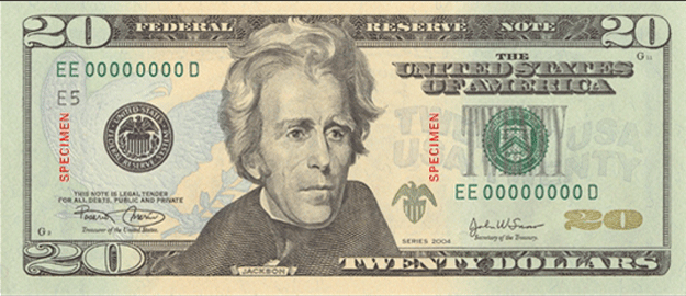
TwentyDollarBill

Temperature-sensitive wine labels

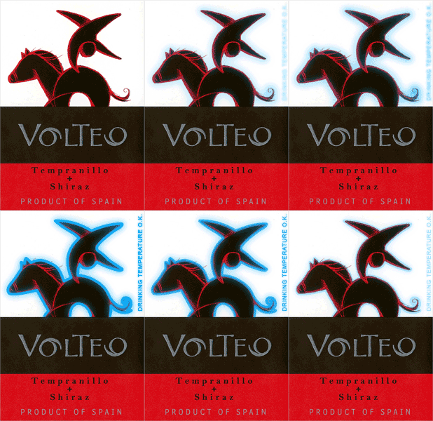
I recently opened a bottle of wine from Volteo with temperature-sensitive ink in the label that turns blue when the wine is at the optimal serving temperature (a la Coors Light).

Volteo_smart_label

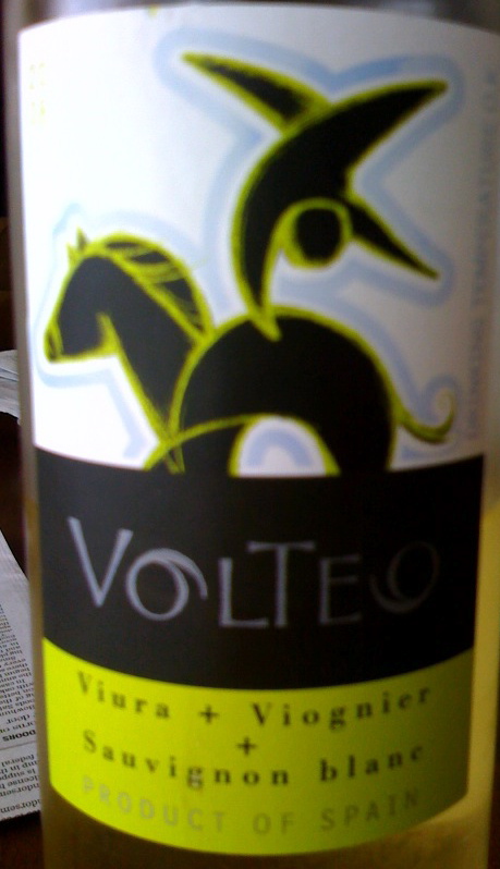
Note in addition to the outline of the horse and rider, the phrase “Drinking Temperature O.K.” appear on the side. The example animation above, from the Volteo website, exaggerates the effect a bit. Below is a photo I took of the bottle I had (a white wine from the same producer).

Volteo_TempLabel_snapshot

I understand this technology has been around a while (it was mentioned in Time’s Coolest Inventions 2004), but I think this is the first one I’ve run across and I wish they were more common. I frequently pull my whites from the wine cellar/mini-fridge soon before dinner and throw them in the regular refrigerator to cool another 5-10 degrees. I hate pouring a glass too soon. (Unlike Gary V, I like my whites cool.) This would be useful for reds, too. I don’t believe in “reds at room temperature” meaning my house’s 72 degrees. The general rule for reds is around 60-64 degrees. Now, normally, I’m pulling them from the cellar and they need to warm up a few degrees, but you could watch for the blue to disappear, I suppose.

In terms of aesthetics, If a winery doesn’t want to integrate it into their front label design like they did on the Volteo, it could just be a smallish square on the back label.

So what do you think? Would you find this helpful? Do you run across them very often? If you know of other wines using this in their packaging, leave a comment please.